
The promise of design-in-code is compelling: designers work directly in the browser, changes flow into production, and the gap between design and implementation disappears. We want this future. We’re building toward it.
But wanting something doesn’t make it real.
We evaluated Cursor’s design sidebar—a popular implementation of this vision—using a suite of 89 visual test cases. These weren’t edge cases or exotic configurations. They were the fundamentals: alignment, typography, borders, shadows, spacing. The operations designers perform hundreds of times per day.
The tool failed 43 of them.
In this post, we go through the common errors that Cursor makes when translating CSS into tools that designers are familiar with. Then, we share our open source benchmark for code-first visual editors, like Inspector’s or Cursor’s browser, called PanelBench.
The Standards We’re Applying.
It wouldn’t be fair to evaluate Cursor’s visual editor, without first setting some ground rules of the standards that we are applying. Visual design tools carry implicit contracts with their users:
- Visual tools must be truthful. What the UI displays must match the underlying state.
- Controls must be deterministic. Clicking a button should produce the same result every time.
- Representation must match reality. If a panel shows a value, that value should be correct.
- Editing must never create ambiguous state. The tool should not allow configurations that have undefined meaning.
- Power should not come at the cost of correctness. Features that don’t work are worse than missing features.
In this post we evaluate Cursor Browser and show every failure below violates at least one of these principles. Last, we’ll share how we built Inspector’s visual editor in 2 weeks using an automated testing methodology that allowed us to move fast (with our small team of two co-founders) while outperforming Cursor on each of our 89 visual edge cases.
Evaluation Set
To evaluate Cursor’s visual editor, and our own, we created PanelBench, a repository with 89 visual test cases. Each visual test case works as follows:
- Styles are applied to an element within the test case
- Passing the test means that when clicked, the design panel reports the specific values
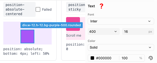
We evaluated each test case by clicking on the lighter box within each test case which has the necessary styles applied
Category 1: The Tool Lies to You
The most dangerous bugs aren’t the ones that break visibly. They’re the ones that appear to work while silently misrepresenting reality.
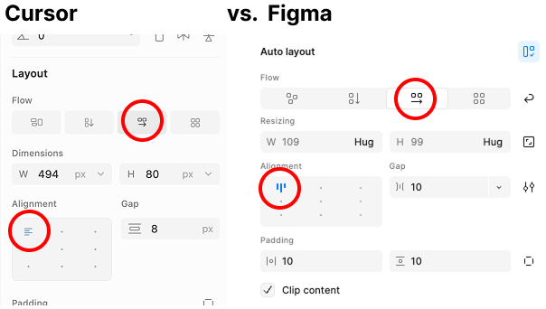
Alignment Detection Is Systematically Wrong
We created simple test cases: elements aligned top-center, top-right, center-right, bottom-center. The editor detected every single one incorrectly when the parent uses horizontal layout.
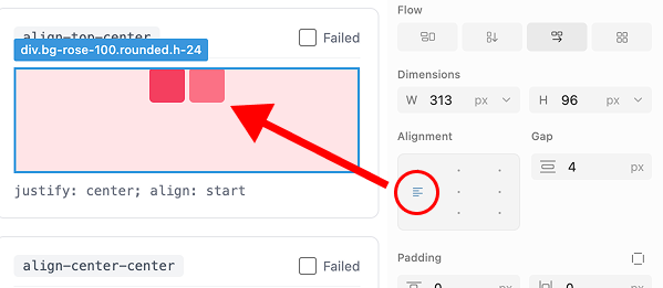
Wrong alignment detected – align top center
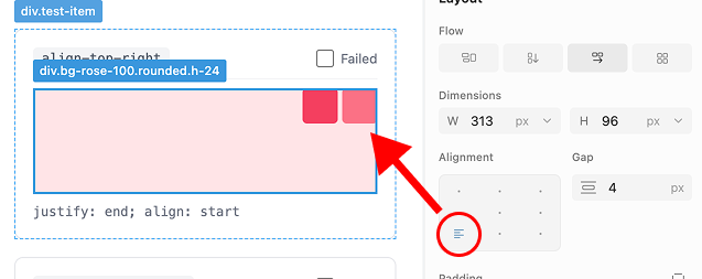
Wrong alignment detected – align top right
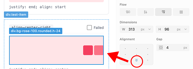
Wrong alignment detected – align center right
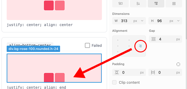
Wrong alignment detected – align bottom center
Four bugs in alignment detection alone. This is the most basic layout operation designers perform.
Alignment Icons Face the Wrong Direction
In Figma and every other major design tool, alignment icons in horizontal flow face downward. The editor displays them facing right, regardless of layout direction. The entire alignment section misrepresents the available options.
Alignment icons are wrong
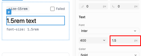
Unit Detection Claims Capabilities It Lacks
The tool purports to detect REM and percentage units. In practice, selecting an element that uses 1.25rem displays 1.3px. The panel rounds incorrectly and shows the wrong unit entirely.
Border Styles Detect as Shadows
Select an element with stroke-center. The editor identifies this as “Inner Shadow and Drop Shadow.” These are entirely different CSS properties with different rendering behavior.
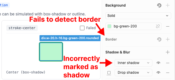
Stroke center detects incorrectly
Category 2: Controls That Do Nothing
A button that does nothing is worse than no button at all. It implies capability while delivering none.
Alignment Buttons Are Non-Functional
The alignment controls don’t just detect incorrectly—they don’t function. Clicking any position except center produces no change. The buttons exist but have no effect.
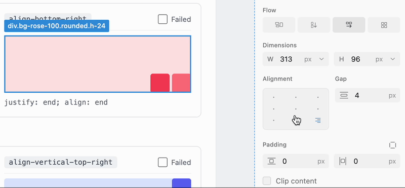
Alignment horizontal lies on every spot placed
Returning alignment to its original position still displays the “Apply” button. The user is prompted to apply a null change.
Text Alignment Displays and Applies Incorrectly
Left alignment displays correctly. Center and right alignment display as top alignment—a completely different property. The controls conflate horizontal text alignment with vertical positioning.
We created three additional test cases. All three failed.
Text alignment does not work
For elements with display: block, where certain alignment options are meaningless, the tool does not disable those options. Three additional failures.
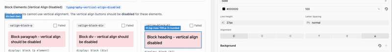
Block doesn’t disable text align buttons
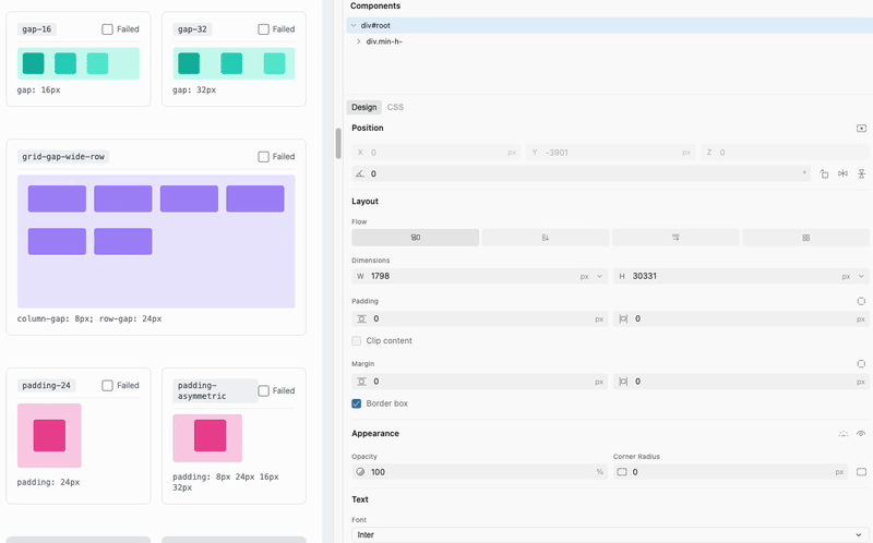
Distribution Is Entirely Missing
We tested justify-content: space-between, space-around, and space-evenly. The editor doesn’t detect any of them. Doesn’t display them. Doesn’t support modifying them.
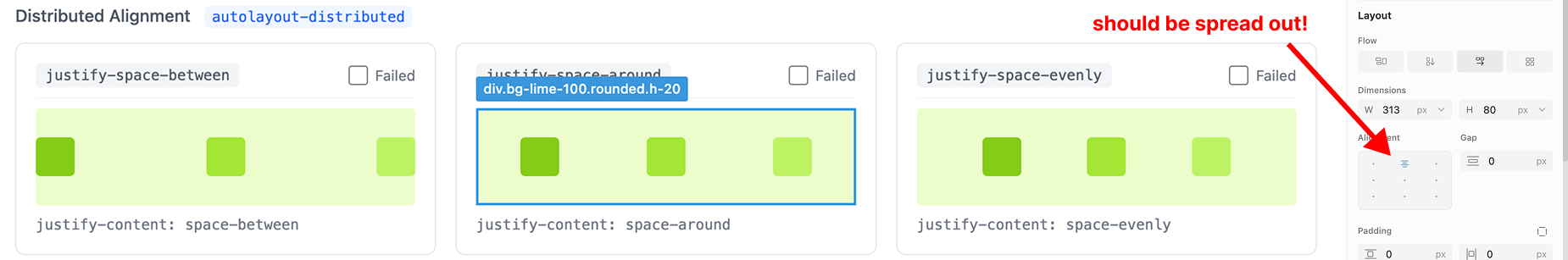
No horizontal or vertical distribution
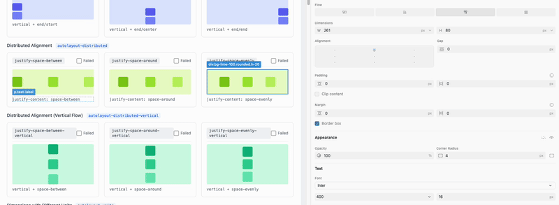
No justify space between, around, or evenly
Variable Fallbacks Fail Silently
Background colors defined using Tailwind CSS variables with fallbacks don’t render in the panel. The tool shows nothing rather than indicating partial support.
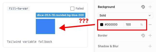
Cursor fails on vars that are Tailwind fallbacks
Standard Color Formats Unsupported
RGB and HSL are standard color formats in both CSS and design tools. The editor supports neither.
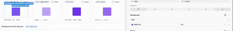
Cursor does not support RGB or HSL
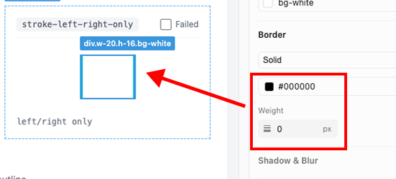
Border Styles Fail to Detect
stroke-outside produces no detection. The panel displays nothing.
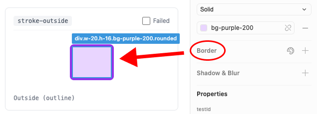
Stroke outside just doesn’t detect
Category 3: Hostile Interaction Patterns
Even when features technically function, the interaction patterns work against the user.
Inconsistent Keyboard Navigation
Arrow keys increment and decrement values for Grid gap. For Flexbox gap and margins, they don’t. Users must manually type every value change.
Key up/down grid and horizontal
Coupled Controls That Should Be Independent
Adjusting vertical grid gap also changes horizontal grid gap. These are independent CSS properties being modified in tandem.
Adjusting grid gap vertical affects horizontal
Spatially Incorrect Control Mapping
In every major design tool, corner radius inputs are positioned to match their visual location. The editor swaps bottom-left and bottom-right. The control at bottom-left modifies the bottom-right corner.
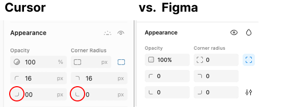
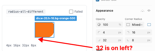
Why corner radius choice is important
State That Persists Incorrectly
Selecting an element with mixed corner radii expands the radius controls. This expanded state persists for all subsequent selections, regardless of whether they have mixed values.
Ambiguous Sizing State
flex-grow indicates that an item’s size is computed by the flex layout algorithm. The editor allows manual resize on these elements, creating ambiguity: is the size manually specified or algorithmically computed?
You can change dimensions on flex-grow
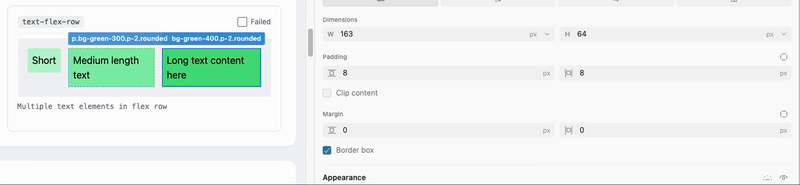
You can change dimensions on text-flex-row
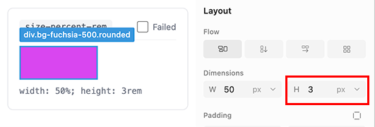
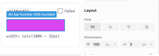
Incorrect Size Calculations
The editor displays an element as 100×3px. The element is not 100×3px.
Category 4: Incomplete Implementation
Features that ship partially implemented set incorrect expectations.
Typography Controls Appear Universally
The typography panel displays for elements containing no text. The controls are present but meaningless.
Typography appears on everything
Inconsistent Border Style Support
Dashed borders exist in the interface but receive minimal support compared to solid borders.
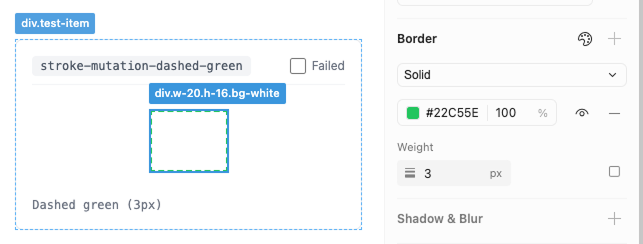
Dashed are second class citizens
Mixed Values Don’t Expand
When an element has mixed border widths, the UI doesn’t expand to show individual values.
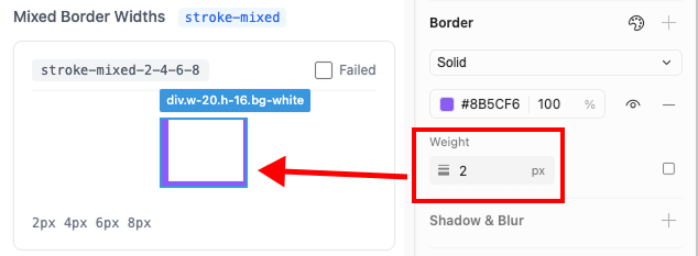
Mixed border widths don’t expand when detected
Border Detection Is Incorrect
Even when borders are detected, the displayed weights don’t match the actual values.
Elliptical Radius Unsupported
Elliptical border radius—an uncommon but valid CSS feature—doesn’t function.
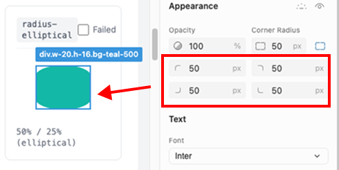
Elliptical Radius doesn’t work
Shadow Classes Detect Incorrectly
Tailwind shadow utilities detect as multiple discrete drop shadows rather than their semantic class:
shadow-sm→ 3 drop shadowsshadow-base→ 4 drop shadowsshadow-lg→ 4 drop shadowsshadow-xl→ 4 drop shadowsshadow-2xl→ 3 drop shadowsshadow-none→ 3 drop shadows
shadow-none detects as three drop shadows.
Category 5: Transform Failures
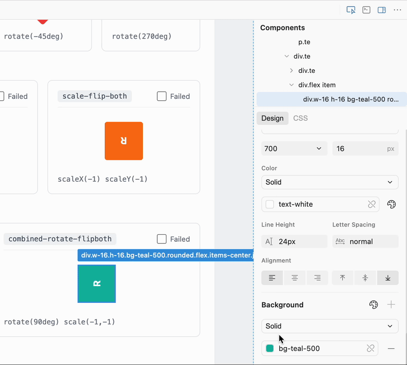
Flip Axes Are Swapped
Clicking “flip horizontal” produces a vertical flip.
Flip Removes Rotation
Applying horizontal flip to a rotated element removes the rotation entirely.
The Pattern
43 failures across 89 cases isn’t just a quality issue. Recently, the design community has been bombarded with tons of new tools.
There’s tons of hype, virtue signaling around AI in the design community right now. More demos are coming out of AI than actual useful tools for designers. Let’s flip that script.
These failures share a common thread: the tool prioritizes the appearance of capability, appearance of usefulness over actual correctness. It has alignment buttons that don’t align. Unit detection that shows wrong units. Controls that create ambiguous state rather than preventing it.
Just a few weeks ago the design community entered a debate over what was, quite literally, a tool that doesn’t work about half of the time (as we showed here today).
Before we make sweeping judgements about the future of design, we should first actually make tools that are useful, or at least work.
In an era of rapid change for designers, trust is not a commodity. As a designer, programmer, and long-term Figma user, Cursor has lost my trust.
Not because they shipped too early, but because they declared design forever in code on a half working product.
These Tests Are Open Source
We’ve published our complete test suite. Run them against any design-in-code tool and make sure what you are using is reliable, and run them against ours to compare it to Cursor! In this article, I’m not claiming that we are perfect (we don’t support rounded-elliptical!), but if you give our product a try, I can tell you the side panel will be a lot more reliable than Cursor’s.
Here is the repository: @PanelBench
Building Toward Correctness
We are building Inspector to treat these behaviors as invariants, not suggestions. We do, believe it or not, actually test our software before pushing it out, and are looking to make the best, most reliable experience out there.
If you’ve been frustrated by existing approaches, are looking to design in code, Inspector is what we believe the future should be.