Somehow I have managed to get some time in the past couple weeks to work on my newsreader app, which I had been calling NewsRadar. Last week I had an epiphany, and realised it ought to be named NewsDrawer — not only an homage to one of the best user interface controls left on the cutting room floor, but also as a metaphor for how I want the app to function: articles are calmly deposited into appropriate “drawers” governed by sophisticated database queries that the user can write themselves.
My renewed energy to work on NewsDrawer started a week or two ago when I began prototyping a feed organiser window to solve a frustration that I have with most newsreading apps. The issue is that when the only way to manage subscriptions is messing around in the sidebar, things quickly get out of control as soon as you have more than 10 feeds and several categories. So I want to have a professional-grade user interface for managing these things quickly. In last week’s weeknotes I put a screenshot of my first attempt, but it was really bothering me how hideous the toolbar is when toolbar button icons are simply SF Symbols glyphs.
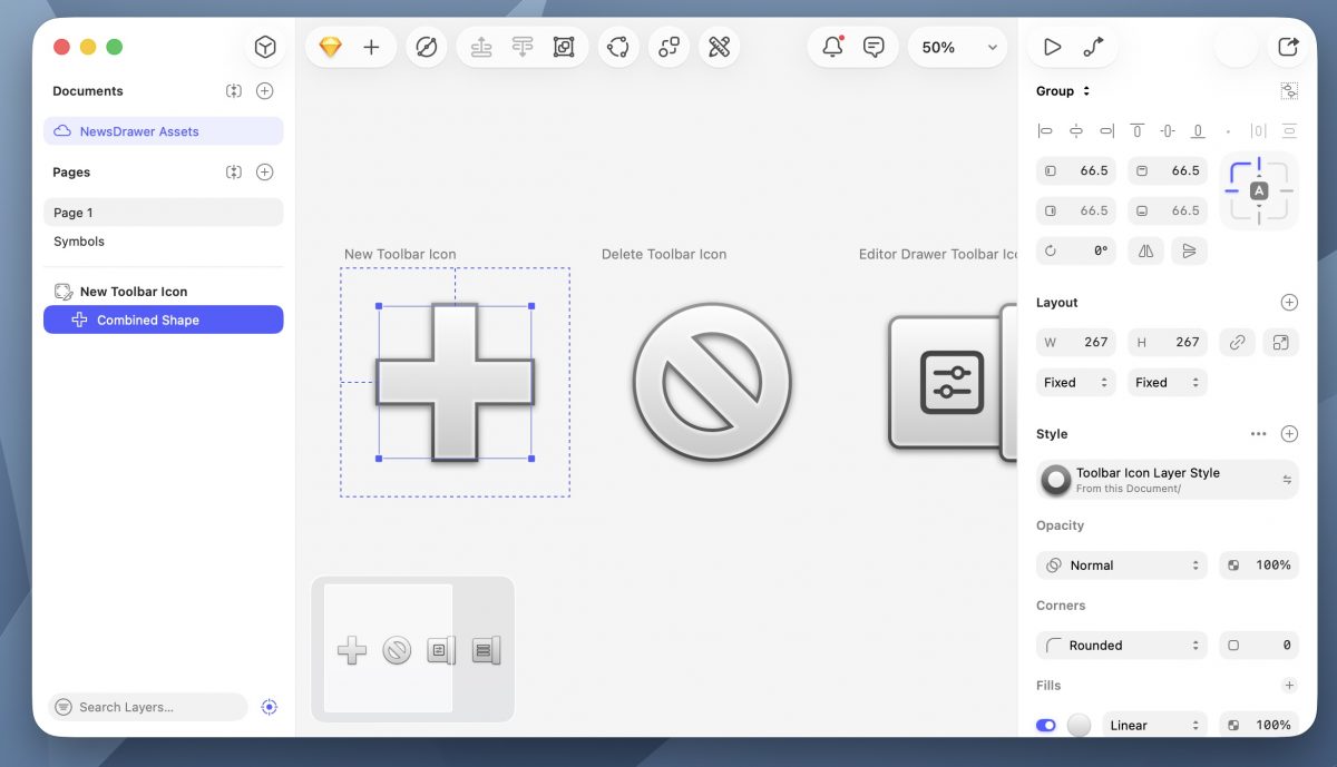
As a first step, I began drawing some classic-style toolbar icons using the amazing Sketch app, which is really one of the last great professional Mac apps.

I am not an icon designer, or a visual designer of any kind, but this was extremely easy. I adapted my toolbar to use these icons, but then I realised that the nice shaded icons looked out of place in macOS Tahoe’s horrible “sea of white” design, so I replaced the window chrome with a slight gradient inspired by Mac OS X 10.4 (Tiger). But if you give a mouse a cookie, he will ask for a glass of milk—naturally, the horrid window buttons that we have endured since Mac OS X 10.10 (Yosemite) began to chafe, and I of course needed to re-draw these. Anyway, it seemed that the time had arrived to bring back my old AquaUI project (but done better), so I set to work, drawing various controls in Quartz. As you can see in the screenshot below, I have done a far better job than last time drawing the window traffic light controls.

NSSearchToolbarItem stands out like a sore thumb, and I may need to re-draw it from scratch.Although the styling is inspired by Tiger’s version of Aqua, everything is drawn programmatically in Quartz using NSBezierPath, NSGradient, and NSShadow. You may have noticed the little lozenge-shaped button in the upper right-hand corner; this is of course the toolbar toggle button, which is one of the most beloved affordances of Mac OS X that was lost in 10.7 (Lion). This is actually really easy to restore, as the vestigial functionality is still present.

NSWindow, which was lost in Mac OS X 10.7 (Lion).Naturally, the inactive window state introduces some subtle transparency and pinstriping, which I have implemented as a custom NSColor that tiles a programmatically drawn NSImage.

What comes next is a thorough redesign of the main feed view, which is currently using a sidebar. Unfortunately, the new behaviour of sidebars starting from macOS Tahoe is extremely hostile to the user and does not go with the Aqua styling that I am using, so I need to rethink how this should work. I am considering reconstructing from scratch the old non-full-height sidebars from Mac OS X, but this will be a lot of work. (Why not a drawer? As the HIG pointed out in the old days, not everything should be a drawer; I think this is an example of something that really ought to be a sidebar.)