February 1, 2026
Font rendering is a technology that often gets taken for granted — it’s hard to imagine interacting with computers without it. But how hard could it really be? Turns out, way harder than you might think:
- Text can be rendered at arbitrary sizes. How is font data encoded such that glyphs remain high quality regardless of the target resolution?
- Fonts are generally curved, pixels are not. How should we anti-alias glyphs to keep text visually appealing?
- How should we design a system that respects the different layout rules of different languages (e.g. English vs. Arabic)?
Looking at FreeType (GPL-licensed, used in e.g. Chromium, GNU/Linux, etc.), they claim to be >200k LOC.
I decided to roll my own. In this article, I provides a high level walkthrough of the TTF file spec and my implementation. But first, why not just use FreeType, or some other equivalent? What’s the benefit of going through it yourself?
- Develop a deeper appreciation for the foundational tech that lets us use e.g. the internet. Without it, you wouldn’t be reading this right now.
- Build an intuition for the amount of work required to render a web page / GUI. Why is font caching important? How might we lower render times?
- Having a good understanding of the fundamentals unlocks the ability to extend it further. E.g. adding programmatic borders via SDFs.
- It’s fun, why not. We’re fans of recreational programming here.
The TTF file format
Before we can start rendering strings, we first need to read the font data in. I focused on TTF (TrueType) file format for my implementation. The other generally used format, OTF (OpenType), can be considered a superset of TTF (also including PostScript fonts), so if you wanted to render OTF fonts, you’d have to make a TTF parser anyway. There are plenty of fonts expressed using TTF over OTF, certainly enough to cover my initial use case (latin alphanumeric glyphs), so I doubt I’m going to extend the implementation to OTF any time soon.
At a high level, TTF files provide some mapping between character codepoints to glyph information.
What is a codepoint?
A character’s “codepoint” refers to its unicode encoding format. You may be familiar with ASCII encoding, which is a 1-byte wide representation of each character in the latin alphabet (for example, the character ‘A’ maps to 65, ‘z’ maps to 122, etc.). A major limiting factor with ASCII is it doesn’t provide nearly enough space to describe non-latin languages as well. Unicode is an internationally adopted solution to this problem. Unicode has various encoding formats, for example UTF-8 and UTF-32; their only difference is how they encode this codepoint (UTF-32 always represents codepoints using 4 bytes, UTF-8 uses a variable length). Conveniently, UTF-8 is backwards compatible with ASCII (thanks, Ken Thompson & Rob Pike). Since I’m only focusing on the latin alphabet for now, this means the codepoint for ‘a’ can be retrieved via (uint8_t) ('a'). Read more about the Unicode standard here.
What is a glyph?
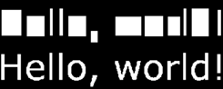
Glyphs are just an abstraction over letters and characters. TTF files have no notion of what the letter ‘a’ is, rather it’s an opaque mapping of some value (unicode codepoint) to some data about that value (glyph). This includes the literal points and curves associated with that line, so that we can draw it, as well as additional metrics about that character that we need to be careful to consider — the latin alphabet highlights why these metrics are important, look at this image as an example:

Here, the same string is rendered twice (below: the readable string, above: each glyph’s texture is fully opaque). Observe the differences between glyphs — how the center sits in relation to the baseline, how much space is added between characters, all of this is highly dependent on which font and which characters you’re trying to render. To learn more, I would recommend taking a look at the FreeType documentation.
Getting back to TTF files, you can find the reference manual here. You’ll quickly notice that the overarching file format itself isn’t too terribly complicated; there are a number of tables that contain different pieces of information on the individual glyphs that make up the font as a whole. Only a handful of tables are immediately relevant:
glyf: Stores the glyph shape data.loca: Maps glyph indices to offsets in theglyftable.cmap: Maps unicode codepoints to glyph indices.
From this, we can start to paint a picture on how we should get to our font shape information. For each character we want to render:
- Determine its glyph index via the
cmaptable. - Determine where the glyph data is in the file by looking up its corresponding value in the
locatable. - Extract the font shape information in the
glyftable.
There are a few other tables that have some useful information worth noting:
head: Contains global information about the font.maxp: Describes maximum values for some parameters in the font (e.g. “how many glyphs does this font contain?”), which is useful for bounds checking.hhea: Contains information about horizontal fonts. This contains theascentanddescentvariables, useful for determining the total vertical size of the font.hmtx: Table describing the horizontal layout of each glyph (e.g. a glyph’sadvance).kern: Optionally provided table describing additional kerning information for pairs of characters.
There are certainly other tables for you to inspect as is relevant to your use case (e.g. vhea and vmtx exist for vertical languages). A major part of the TTF file spec is specifying instructions for scaling the font to specific resolutions — this becomes more important if you’re planning on only supporting bitmap rendering at smaller scales. I’ve found that alternative approaches, namely SDF-based rendering, achieve high quality results without having to muck about with this part of the spec, so I’ve ignored these tables.
One of the main challenges at this step is validating the data you’re reading in from the TTF file data, since we’re reading from an opaque binary blob (which, at least I’m not super used to). Running a debugger is your friend here. I’d also suggest becoming familiar with and comparing your results against another known-good TTF parser for comparison when times get tough, I used stb_truetype for this purpose.
Glyph parsing
Great, now we know where our glyph data lives, it’s time to parse it. Follow along in the reference manual: here.
TTF glyphs are comprised of a series of contours, which themselves are described as a series of quadratic Bezier curves. These are comprised of 3 points: a start point, an end point, and a “control” point. Bezier curves are formally defined as a “linear combination” of these points (start -> control -> end), where, given t in range [0, 1], calculate the linear interpolation between point pairs, recursively, until you collapse to a single point. For example, for a given t = 0.4, we place an intermediary point 40% of the way between the start and control point, and 40% of the way between the control point and the end point, then repeat, placing our final, on-curve point 40% of the way between our intermediary points. This is repeated for all t values between 0 and 1 to create the final curve. This is probably easier to understand visualized:

Another way to describe quadratic Bezier curves is by the formula: (((1-t)^2) * P_start) + (2(1 - t)t * P_control) + ((t^2) * P_end), where, again t is in the range [0, 1] (this isn’t so bad once you realize this is just a regular quadratic under the hood).
Moving back up the chain, these curves are combined to form contours, which are combined to form the overall glyph shape. As an example, here are the contours describing the glyph ‘B’ in the Consola font, where each contour is a separate color (note that Bezier control points are colored in purple):

We see that, in this case, there are 3 separate contours: one for the “outer shell”, and two for the “holes” to cut out of it. The TTF spec requires that these classes of contours be defined separately — the ordering of “shell” contour points must be clockwise, and “hole” contour points must be counter-clockwise. We will use this information later when rasterizing the glyph to know when we are entering or exiting the shape, so it’s good to note here.
TTF stores the quadratic Bezier points in a set of contiguous arrays, that, once parsed, collapse to a pretty simple struct:
struct GlyphPoint {
    B8 on_curve; // If false, this point is a control point.
    V2 position; // The corrected position of the point (originally provided as a delta from the previous point).
};
Next, we need to unravel a bit of compression TTF applies to our point data. Sometimes, it omits points from the stream — we have to add them back in. Consider that the expected stream of points would look something like: point (on-curve) -> point (off-curve) -> point (on-curve) -> repeat. Looking at the data stream we are actually provided, we often encounter situations like point (off-curve) -> point (off-curve) — what do we do here?. In these scenarios, an on-curve point is implied to be at the midpoint of these off-curve points, and we need to add it in ourselves. Additionally, the spec is happy to give you cases like point (on-curve) -> point (on-curve) — there aren’t any tricks here, this is just a straight line between these two points, it’s just another case to be on the lookout for that’s separate from the quadratic Bezier case.
The way I chose to model this is by describing the curve as follows:
struct GlyphCurve {
  V2 point;   // Start point of this curve.
  V2 control;
};
Where the end of the bezier curve is implied to be the start point of the next bezier curve in the contour. I chose to force line-cases into this model by inserting an unnecessary control point at the midpoint to simplify processing later down the line, you can certainly choose to break these cases apart and handle them separately.
The file spec also describes “compound glyphs” — this is essentially another form of compression. Some characters contain sub-glyphs that are commonly used throughout a given font (think the dot over ‘i’ and ‘j’, or diacritics over characters like é) — rather than copying the countour data several times to cover all of the characters, TTF instead defines them in as separate glyphs, and instructs you to merge them using a set of transformations as relevant for the target character. The exact transformation calculations are described in more detail in the spec, but the hard part of actually retrieving the contour shapes themselves is reused as described above.
Glyph rasterization
With shapes in hand, it’s time to get rasterizing. The algorithm is loosely as follows:
-
Identify a target portion of a bitmap we want to rasterize to.
You could generate separate bitmaps for each character, but it’s likely may more efficient / optimal to generate an atlas comprising all of your characters, and index into that when issuing draw calls to the GPU later down the line. This is what I did. Therefore, we need to determine which sub-section of the atlas to render the character bitmap to.
-
For each row (y-value) in the target bitmap, determine the corresponding y-value in glyph space.
This can be done by a simple linear mapping between the two spaces. E.g. we know the height of our target bitmap and the height of the glyph, so, given some y value in target bitmap space, the corresponding y in glyph space can be found by using proportions (
y / target_height = ??? / glyph height). One thing to pay attention to here is we want to measure from the middle of the pixel, not the top or bottom. -
Determine the x-intersections in the contour for our y-value in glyph space.
This can be done by solving for
tin the quadratic Bezier formula — in cases where0 , we have an intersection (since the curves are chained together, I only checked for intersections0 , asBezier_n(1) == Bezier_n+1(0)). BEWARE! that solving the quadratic involves dividing by some variable value, which can be 0 -- these cases describe Bezier curves that are secretly lines. For these cases, you should instead check for a linear intersection instead. My earlier decision to force lines into a quadratic Bezier representation works nicely here, because we have to implement this check anyway. -
For each intersection, determine if it’s “entering” or “leaving” the shape.
E.g. consider a ray shooting across horizontally at the hole in the letter ‘A’ — there are four separate intersection points along this line. We need to determine which sets of intersections constitue “in” and “out” of the shape. It’s reasonable to think that we should always have an even number of intersections for a given line; for every entrance there must be an exit. However, in reality, due to floating point precision errors (and other eldritch magic), this may not always be the case.
This can be handled by taking advantage of how contours are described in the TTF spec. As described previously, “shells” must be defined clockwise, and “holes” must be defined counter-clockwise. Therefore, by looking at the derivative of Bezier curves we intersect with, we can determine whether we are entering (y-value increasing) or leaving (y-value decreasing) the shape. The Apple spec recommends accumulating a running winding count as we encounter intersection points — this is implemented by +/- 1 for each intersection we encounter depending on whether we are entering or leaving the shape. When the winding order is > 0, the pen should be down and we should be drawing. Otherwise, the pen should be up.
-
Convert the intersections to target bitmap space, and rasterize.
Now that we have all the information we need, we can index into our target bitmap and color it in depending on whether each x-value is in or out of the shape.
Great, we’re done! What do the results look like?

Pretty bad… Why? From what I can tell, this happens for a couple of reasons.
-
The lack of anti-aliasing (although, enabling linear sampling doesn’t save it…).
-
TTF fonts have additional instructions for how to render bitmaps at various sizes that we’re willfully ignoring right now.
-
Bitmap fonts don’t scale very well.
Ideally, we want our bitmap atlases to be of a relatively small point size, to save on memory space. However, from my experience, we only really achieve decent-looking results when the font size is relatively high (the example here is rendered to a size of 32 pixels, and still looks bad).
SDF glyph rendering
There are a number of options we can do to correct our suboptimal font rasters (MSDF was another option I considered, you could also look at sub-pixel rendering). I chose to go with generating an SDF for the glyph, which was attractive, as it’s fairly straightforward to add on as an additional step to what has already been implemented here (e.g. for bitmap rasterization). Furthermore, SDF fonts scale very well to arbitrary resolutions, which is a reasonable constraint e.g. when rendering signs, etc. in 3D environments (e.g. games where the player may walk arbitrarily close to the font being rendered). I’ve also found that SDF fonts look reasonable in 2D scenarios as well (e.g. for UIs, menus, etc.).
But first, what even is an SDF? How will it fix our problem here?
SDF stands for “signed distance field”. SDFs can be described as a functional representation of an arbitrary shape that determines the distance to the edge of that shape (“signed” comes from this value being negative inside the shape, positive outside the shape). As relevant for font rendering, instead of computing a binary “is this in or out” decision for every pixel in our target bitmap, we determine the distance from that pixel to the closest point of the opposite state (drawn or not-drawn). This provides a smooth gradient along the edge of the shape of “in-ness” that we can leverage along with the GPU’s ability to quickly and efficiently interpolate between values at scale to render font characters at a higher range of resolutions compared to raw bitmap representations. To learn more about SDFs (and how they can be more generally applied to 2/3D shapes), this article by Xor is a good starting point.

Here’s an SDF for the letter ‘B’. Notice how there is a gradient around the letter as we extend further beyond the hard edge for the letter — we can use this to anti-alias the raw bitmap.
To generate the SDF of a given glyph, as per this Valve paper on the subject:
-
Generate the bitmap of the glyph.
This reuses what we implemented before entirely.
From my experience, rasterizing a comparatively large bitmap is important here, to provide a high level of granularity to the later steps. Essentially, the higher the resolution, the more accurate the distance measurement is later, leading to higher quality results. Since the bitmap raster is not maintained after the SDF is generated, we don’t need to pay that high of a memory cost to hold the high-resolution bitmap raster over a longer period of time. I default to a bitmap font height of 64 here.
-
Similarly to bitmap rasterization, we need to determine where in a target bitmap to place the SDF raster.
-
For each pixel in the SDF target bitmap, we need to determine which pixel is closest in the raw bitmap. This is similar, but slightly different from generating the raw bitmap — in that case, we only needed to map target bitmap y-values (here, we do it for every pixel).
-
For every pixel in the target SDF bitmap, determine the closest distance to a pixel of the opposite state in the raw glyph bitmap.
This can be done by choosing some “spread factor” (kernel size) and searching in a square of that size around the target pixel. This parameter is tune-able, I’ve found a value of 4 is reasonable here. In cases where no on pixel is found, use the maximum distance possible for the given kernel size.
-
Map the distance to a byte range [0, 255] and save that to the SDF atlas.
A caveat here is that the produced SDF bitmaps here aren’t meant for rendering by themselves — these are better described as a cache of SDF function values for each candidate glyph. So, we need additional instructions for how to convert these distance values into an actual bitmap we can draw to the screen. I produced a shader (OpenGL) for this purpose. Of more interest is the fragment shader:
#version 330 core
uniform sampler2D atlas_image;
uniform vec3 text_color;
uniform float threshold;
uniform float smoothing;
in vec2 glyph_tex_coord;
out vec4 frag_color;
void main() {
  float dist  = texture(atlas_image, glyph_tex_coord).r;
  float alpha = smoothstep(threshold - smoothing, threshold + smoothing, dist);
  frag_color  = vec4(text_color, alpha);
}
You’ll see that we extract the cached distance value for each given pixel we’re rendering, applying some smoothstep over it to determine the alpha, using the result in the final pixel color. Put simply, this determines at what distance along the field of “in-ness” around the SDF do we actually consider in and out of that character. This is controlled by 2 parameters, threshold, which is the cut of in / out, and smoothing, which applies some gradual transition / blurring over the threshold value.
So, what do these results look like?

Much better here. What does this look like side by side with the raw bitmap? Are there still deficiencies in SDF rasters?

This is using a bitmap height of 100 and SDF height of 32 (scaled to various render heights). You can see that, by and large, SDF looks better than raw bitmap across the board. But, we start to see some undesirable artifacting appear at larger font sizes. This can be corrected by rendering the SDF atlas at a higher resolution, but that comes with a higher memory cost associated, so pick your poison.
In the end, the results don’t look too bad. Here’s an example where I’m using this technique to render some UI widgets:

My implementation can be found in full here.
If you’re looking for more resources on learning how to roll your own font rendering, I recommend the following: