Minimalism came in like a wrecking ball somewhere around 2013. It delivered a terminal diagnosis to all but a few prevailing designs at the time. One of them, called Oxygen, had reigned supreme in KDE Plasma. As with many others, its demise was inevitable. Anyone aspiring to demonstrate that they were building something new and modern had to close the door on older designs.
As someone who first started using KDE during the later releases of its fourth generation, I found the Oxygen design quite likeable and pleasant. By that I mean the icons, the desktop theme, the application look, the window decorations – really, the whole package. Although today we often talk about Oxygen alone, there was also Air when it came to desktop themes. Air was, in fact, the default theme for the majority of KDE 4 releases, while Oxygen was its sidekick.
The themes survived the major transition from KDE 4 to Plasma 5 and remained part of the official KDE packages. The move to Plasma 6 did not change that, although the desktop themes stopped being shipped alongside Breeze. More specifically, Oxygen was relocated to the optional oxygen repository, while Air was left out. This feels like an undeserving fate for a theme that played such a significant role in the KDE 4 era, and for a theme that offers a complementary lighter experience to the darker look Oxygen provides.
Which is why work is underway on Air’s comeback in Plasma 6.7! 💨
Now that I’ve shared the happy news, it’s time to get into the more serious questions surrounding Air and Oxygen. These questions arise from the fact that both desktop themes have seen only sparse maintenance for well over a decade. Somewhat surprisingly, Oxygen is the one that exhibits more issues than Air. But let’s take a step back first.
Air and Oxygen – KDE 4 vs. Today
Here’s some screenshots fresh from the virtual machine housing Kubuntu 14.04:


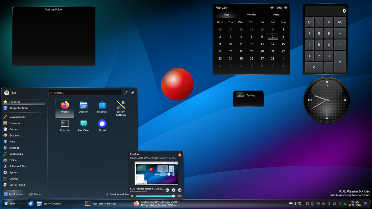
Now let’s look at how these two look like today:


What’s the first thing you notice? For me it’s that Oxygen and Air were using headers and footers in applet dialogs way before someone though of adding them to Breeze! Coupled with the fact that it’s easy to reintroduce them today from a technical point of view, it begs the question to be asked at some later point… should we re-add headers?
The second notable difference would be that present-day Oxygen looks different. The Windows Vista-like glossy and gradient-heavy panel is gone, and the tasks that sit in the panel no longer have a framed box with a pronounced blue glow on hover and press. I haven’t been able to quite dig up why and how these divergences happened, but my hypothesis is that it was a conscious restoration of the much older Oxygen design (pre KDE 4.2). For stylistic reasons, I’m guessing someone also changed the text input field and the buttons to be dark instead of light.
On the other hand, the Air theme is closer to its original design, excluding structural changes that can’t be influenced. It’s noticeable, however, that some elements lack padding and that widgets should be more transparent to match the light and airy feel the theme aspired to.
The next important thing is that a lot of icons are goners. There’s nothing that can be done about this in the desktop theme since in Plasma 6 themes can’t use their own icons. Users have to pair these old themes with an icon theme of their choice. Unfortunately if the Oxygen icon theme is used, we get some mismatched symbolic and colored icons, and some missing icons, so there’s work to be done there too to restore the full icon experience.
What could/should be fixed?
I’ve identified several critical bugs and glitches with Oxygen:
All three of the issues shown in the pictures affected legibility because there was just not enough contrast between elements. Fortunately they should all be fixed by the time Plasma 6.6 is released this month.
In addition to this, I merged fixes that restore Oxygen’s original action button and I also added support for newer tooltips you see in some places on the desktop. These changes will land in 6.7 since they’re not quite bugfixes.


Regarding what to do next, these would be the steps:
1. Cleanup of the existing files
- Involves cleaning up old SVGs no longer used, as well as cleaning up the ones that are internally (removing unused layers, adjusting document margins, documenting things better etc.).
2. Improving looks all the while making the themes resemble KDE 4 more
- Involves a parallel process of tracking if there’s glitches in Plasma 6 and looking at the KDE 4 version to see what things should ideally look like.
- Here it’s important to add that some things are structurally different in Plasma 6 and work on the desktop theme just can’t solve it (menus and some tooltips are not styled by the theme; icons are provided by the icon theme)
3. Adding new graphics
- This involves testing with all of the Plasma 6 components to see what needs to be added to complete the theme.
- Raises interesting questions like should headers and footers be implemented.
For instance, both Air and Oxygen are in need of new SVGs that would give them their own designs for switches:

Why preserve (and persevere)
We don’t usually knock down impressive old buildings simply because they’re no longer trendy, nor do we cast aside good artwork just because it’s fallen out of fashion. Leaving old code behind, on the other hand, is often perfectly reasonable – code has little inherent value beyond the utility it provides. In that sense, it’s much like replacing outdated home installations: everyone is happy to adopt new technology when it offers clear benefits.
That’s not the case with design. Artwork such as Oxygen carries genuine artistic value. Even if we might approach certain aspects differently today, it’s still hard not to admire the beauty of the details found throughout its many parts. And being the main theme in KDE 4, it also carries historic value.
Thankfully, this old theme is still around because there has always been someone in the KDE community willing to step in and patch it up. I’m sure a sizeable number of users, myself included, are very grateful to those people. Still, despite their efforts, the theme has effectively been on life support. We can admire and appreciate it, but if we don’t do what we can to keep it functioning properly, someone may eventually reach for the deprecation axe when Plasma 7 comes knocking. From a technical and cost–benefit perspective, continuing to support themes that are no longer part of the default offering means spending energy on maintenance with diminishing returns. As dismissive and neglectful as that viewpoint may be of artistic and historic considerations, it becomes much harder to argue against if the porting candidate is in poor shape. So the goal I’m putting forward is this:
Air and Oxygen should look their best when users update to Plasma 6.7
And if any of you would like to pitch in, your help would be greatly appreciated. I’m also happy to say that the original creator, Nuno Pinheiro, has expressed a desire to join in on the effort! The next time I write about this, I’m looking to report meaningful progress towards the goal laid out.