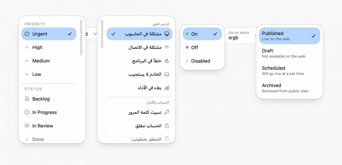
This post pushes customizable to an extreme. I think it turned out nice.
It’s mostly CSS! A li’l JS sprinkle just to position the ::picker() and the selected option together; the JS is nice to have, CSS does the real work.
superellipse forced colors light/dark theme slick scrollbar scroll driven animations scroll-state stuck query scroll-state scrollable query overscroll behavior smooth scroll RTL support text-box trim spring easing anchor & anchor fallbacks color-mix()
Chrome only atm, and I keep mobile with the native select. Still cool!
Core Architecture
#
This component builds on the new appearance: base-select foundation, combining native accessibility with sweet visual control. Progressive enhancement ensures the custom experience only loads on capable devices.
The examples in this post just look like regular select elements in Firefox and Safari. Firefox is working on it though!
appearance: base-select
unlocks full customization of nativeelements while retaining browser controlled accessibility and keyboard navigation- Conditional enhancement
Only enables custom styling for devices with hover and fine pointer (@media (hover) and (pointer: fine)) - JavaScript + CSS hybrid
JS calculates an anchor offset for alignment while CSS handles all visual presentation and animation
Alignment & Positioning
#
Anchor positioning plus some special JS sauce to write an inline CSS variable unlocks the picker to position near the selected option (obviously this can’t work at the viewport edges). This creates a pleasant morphing effect that feels connected.
Maybe I should have used AIM?
- CSS Anchor Positioning
Picker usesanchor(start)to position relative to the trigger button - Selected option alignment
When dropdown opens, the currently selected option aligns vertically with the button text via--_select-anchor-offsetcustom property - Syncs
transform-origin
With50% var(--_select-anchor-offset)ensures scale animations line up better with the selected option’s position - Anchor fallbacks with
position-tryflip-block, flip-inlineautomatically repositions the anchor position if the picker would overflow the viewport
Animation & Transitions
#
Scale effects with spring physics to scroll-driven option reveals, every interaction respects user motion preferences while providing rich feedback.
Theming & Color Handling
#
Automatic light/dark adaptation leverages system colors and modern color functions for seamless theme switching. Definitely check the support for light/dark forced colors too, a really great way to debug spacing and skeletal aspects of the UI.
Layout & Spacing
#
Logical properties enable true internationalization with automatic RTL support, while text-box trim delivers pixel-perfect vertical alignment. Custom properties create a flexible design token system.
Scrolling & Overflow
#
Scroll-state queries dynamically detect when content is scrollable and when sticky headers become stuck. Custom scrollbar styling and smooth scrolling enhance the browsing experience within long option lists.
Customizable Select Features
#
New pseudo-elements provide surgical styling control over picker components, while superellipse corners deliver the modern aesthetic popularized by iOS. State selectors enable precise targeting of open and selected states.
Accessibility & UX
#
Accessibility is built-in with proper focus indicators, keyboard navigation, and semantic markup thanks to the web platform. Touch-friendly targets and overflow handling ensure the component works elegantly across all input methods.
Performance Optimizations
#
Careful optimization strategies keep animations smooth while minimizing layout thrash. Smart caching and compositor hints ensure the component performs well even on lower-end devices.
will-change: scale
Hints to browser for compositor optimization (also fixes text shift bug)- WeakMap offset cache
Avoids expensive DOM measurements on every interaction;
auto-garbage-collected - Hardcoded layout constants
AvoidsgetComputedStyleforced reflows during initialization. Tried dynamically computing these in a hidden instance, but couldn’t get it as close as just “hardcoding / speficying them ahead of time” in a config - Background clip
background-clip: padding-boxprevents background bleeding under border - Parallel icon variants
Pre-defined black/white SVGs avoid runtime color manipulation
Example Variations
#
The component architecture supports diverse use cases, from simple toggles to rich content pickers. Each variation demonstrates how the base patterns adapt to different content and interaction models.
- Toggle with status indicators
Colored dots (green/red/gray) for on/off/disabled states - Avatar select
Circular images with person names - Multi-line options
Title + description layout for status picker - Grouped options
Fieldsets with sticky legend headers - Label above value
Color space picker with small label text above the selected value - Flag emoji select
Country picker organized by region
Try It
#
Experience the component in action on CodePen:
Wrapping Up
#
There’s room for improvement, please fork and offer feedback!
I tried many variants of animation, trying to reduce some of the shift of the positioning, but never found something that worked across all the variants. Help me?! 🙏
This select component intends to showcase what’s possible when we combine modern CSS features with thoughtful progressive enhancement. The appearance: base-select property provides the foundation, while anchor positioning, scroll-state queries, and entrance animations create a polished, accessible experience.
The real power lies in how these features compose together—each enhancement builds on platform primitives rather than fighting against them. The result is a component that’s maintainable, accessible, and ready for the next generation of web interfaces.
Most importantly, this approach lets us create custom experiences without sacrificing the keyboard navigation, focus management, and screen reader support that come free with native elements.
For more, checkout nice details!
